Red Canary’s brand identity refresh
Red canary is a leading cybersecurity company focused on their mission to deliver expert driven managed detection and response (MDR) to 4,000+ security teams of all sizes. With an emphasis on being relentless, delivering quality, and a customer first approach, the brand has become a recognizable presence in the cybersecurity industry. As the company has seen continued growth, an opportunity arose to refine and uplift the existing visual identity. The vision was to meet the demands of modern security platforms, resonate with canaries and customers alike, and to better reflect Red Canary as the leader it is.
Role: In-house brand identity & logo design
Year: 2024
Creative team:
Milan Klusacek, Dominic Heidt, Dalton Vanhooser, Kelsey Compton
Agency Partner: Shaped By
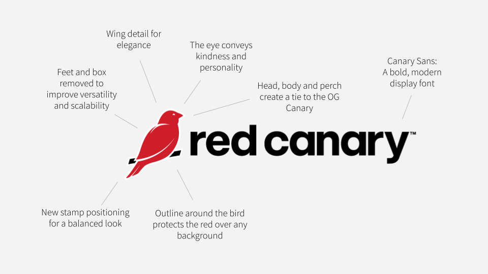
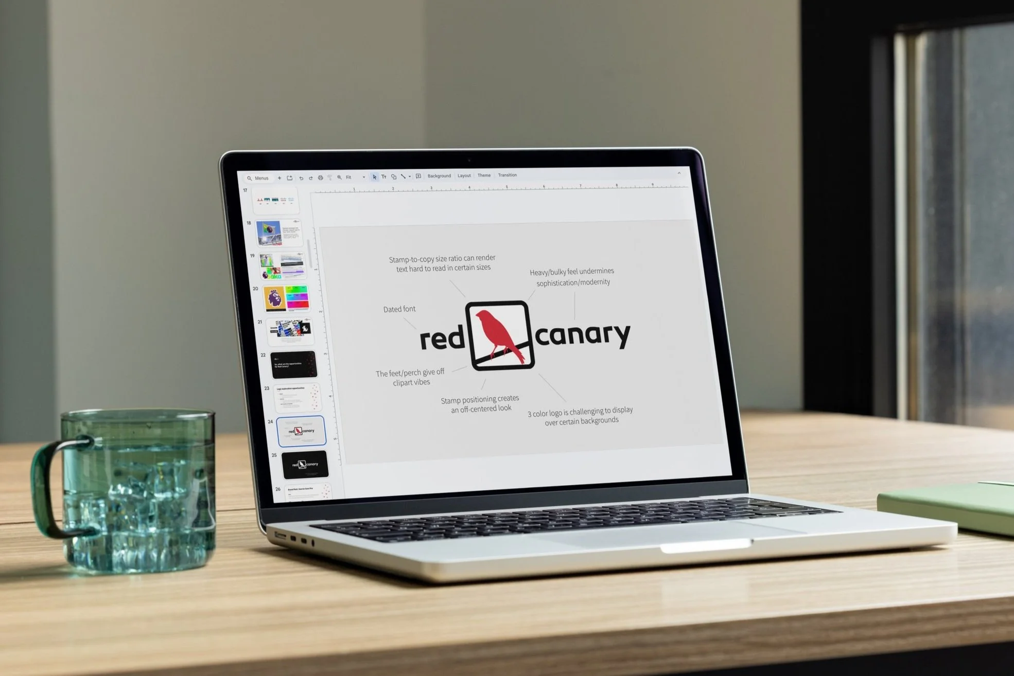
An icon ready to evolve
While the existing logo had become iconic to the brand, it struggled with scalability, clarity, and versatility. From the bulky box and outdated typography to the challenges a multicolor logo that created inconsistent readability across sizes and backgrounds, the current system left room for improvement. We had a clear opportunity to help elevate and evolve the brand while honoring the brand’s origins.

“A strong brand stands out in a densely crowded marketplace.”
Our guiding principles
The redesign should feel like the next step of our evolution, not a new logo.
Think bigger than a “logo redesign” and venture toward the iconic.
The identity should feel both authentic to Red Canary AND different from our competitors


Reimagining the brand for what’s next
This project set out to explore how Red Canary’s logo and broader identity system could be simplified, modernized, and reworked to meet the needs of an evolving, fast paced digital landscape. While preserving the heart of the brand and ensuring it remains recognizable as Red Canary.